Website mistakes are one of the easiest ways to turn people away from your business. It’s essential that when people reach your website, the experience is the best it can be. Users are unforgiving when it comes to website mistakes and will quickly leave your website if there are issues. They will probably go to your competitors’ websites, and you will lose out on custom.
We have put together some common website mistakes that are often easy to solve and can really help your website grow.
Contents
ToggleYour Site Is Too Slow
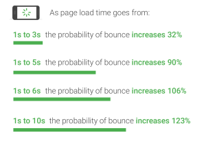
Isn’t it annoying having to sit and look at a blank screen as it loads? This is even more important now with more and more people browsing on mobile devices. Google published research showing how a small change in speed can have dramatic effects on people leaving a site, showing it is more critical than ever.
There are lots of factors that are involved in site speed but a lot of them aren’t complicated to implement. These include:
- Poor hosting
- Large Images – Ensure your image is big enough to show on a decent monitor, but no bigger than that! Uploading high quality images from a DSLR camera for example can massively impact your loading times.
- Too much code/too much going on with the page
Use www.gtmetrix.com to analyse your site and show how fast your pages load. It gives recommendations on what you need to improve so if you looks for any obvious issues it can be a great place to start.

Doesn’t Load Correctly on Mobile
It’s important to make sure that your site looks great on both desktop and mobile, and that people can use the site properly on smaller devices. Older sites which aren’t often mobile responsive just squeeze the page down to the width of the device. This not only looks awful but due to Googles Mobile index, it will actually stop the site from appearing in the search results.
An easy place to test your site is Google’s own mobile responsive test – search.google.com/test/mobile-friendly. This will analyse your page and tell you of any issues. You may need your web developer to help with these or the use of a plugin on WordPress for example, but it’s definitely worth the effort.
Frequent Popups Getting in The Way
Adding people to your newsletter list or getting offers across to people is an important part of many websites, but it’s important to not let it get in the way of good customer experience. People will get annoyed if they have to keep closing popups, especially if they appear on multiple pages. Only show a popup once someone has been on the page for a certain length of time. Or use exit intent popups which only show when the software detects someone is about to leave.
This is even more important on mobile, and Google will actually penalise sites that have intrusive popups. Don’t let the chance of a quick sale cause bigger issues for your site.
Cluttered Design
Another one of our website mistakes that is easy to fix is to de-clutter. People come to a site looking for information so it is important to make sure they can find it easily, and that it’s displayed well. If people see an essay in front of them, they are likely to be put off so break up your text where you can with design features such as images and line breaks.
Poor Calls-To-Action
Your site needs a clear Call To Action (CTA). Whether this is the Add to Cart button or a Read More link, it’s important that visitors can easily see the next step them need to take. A great example of good CTA is Amazon. Wherever you are on the site, it’s easy to know what to do next. By their use of colour for their CTA buttons, it’s an easy experience for such a large site. Why not take some ideas from them and apply them in your own way?

Keyword Stuffed Text
Keywords are important but it doesn’t mean that you should ram your content full of as many keywords and variants as you can. This used to be common practice but now search engines wised up and are able to analyse text and understand the keywords and likely variants without you needing to list them all.
What search engines are looking for is information that is useful for the visitors. Make sure your content is written for the people who you want on your site, who are potential customers.
Trying to rank for every keyword going will hinder your chances of being found online and will bore visitors with your nonsensical content.
Cheesy Stock Images
Everyone wants a site that looks professional and images are a huge part of this. A well-placed image can quickly make a boring site come to life and it’s really true that a picture paints 1,000 words.
However, not everyone has the resources to have their own professional photos taken so they will often lean to one of the many stock libraries online.
They are a great source of imagery however it’s important to use them wisely. Stay away from the cheesy, businessperson kind of image and go for something that really speaks about your business! Stock libraries have a massive choice so spend the extra time to find the best image you can.


Poor Navigation
If you have a larger site with lots of different pages, it’s important that visitors can clearly navigate to find the information they need. This is done with clear menus and often a search bar. When putting together your menu, have a think about the steps people need to take or what they will be looking for – don’t just list every single page.
For example, on an eCommerce store, break your products down into categories, brands, style, colour… anything to make it as easy as possible to find the right product.
Not Showing Delivery Costs
One of the biggest website mistakes you can make selling online is hiding delivery costs until the last minute. Imagine finding the right products at a good price only to add it to your basket and be told there is a delivery cost. This can quickly turn a potential customer towards a competitor, especially if the products are price sensitive and found in multiple sites online.
Be clear about the delivery costs, turnarounds time and returns policies from the start. People don’t mind paying extra, as long as they make the informed choice themselves.
No Clear Way to Contact You
No matter what type of product or service you offer, there will always be a time people want to talk to you to find out more. We’re too busy nowadays to be digging around for your details causing them more stress so it needs to be clear and easy to find.
Don’t forget that different people prefer different contact methods. Some will want a phone number, some an email whilst some people would prefer to fill in a form. It’s not always practical to offer all three options but we would always suggest offering at least a couple. Make it as easy and pain free as possible for someone to reach out to you and not lose a potential sale.
In Summary
Your website should be an organic entity that grows and adapts as your business does. Website mistakes are easily rectified yet can have significant effects on your business. It’s important to always keep an eye on the data you get from the likes of Google Analytics to monitor your changes throughout the life of your site. Technology and trends move on so it’s important to put the correct foundations in place to help your site to grow well for years to come.
Follow these actionable tips to improve your website


